Announcing IlanaCMyer.com
I’m proud to announce the launch of the author site of my talented wife: Ilana C. Myer.
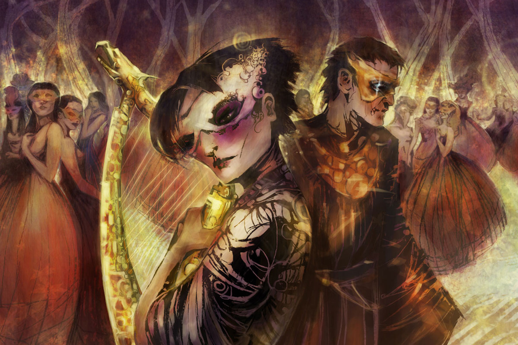
The art is by the very talented Galen Dara; the site design and development is my own. I wanted to take a few words and go a bit into my thoughts behind that design.
The design: The primary purpose of the site is for Ilana to share updates and insights about her upcoming book.
Towards that goal, it was important for me was to have a beautiful readable type. I used Calluna. It has an elegant feel. What struck me about it was the elegance of the serifs, and how it balanced that detail with a clean reading experience.
To balance out the serif body type I used Lato I believe that it was intended to be used as a thinner sans-serif. However, for contrast I used it’s thickest weight. I think it still works nicely.
For Ilana’s name, at the top, we used Neue Hammer Unziale. It’s Celtic look was apropos due to the influences of the book. (You’ll just have to read it to find out more.)
Having commissioned the art, we wanted to put it front-and-center. I felt it would immediately place the visitor into the world of the book. Thankfully, the visual trend now is leaning towards full screen hero images.
The transparent heading before the posts on the homepage is to keep the visitor inside that world, always reminding them of the art. The art can be seen in full by scrolling all the way to the bottom.
The page heading recluses itself as the visitor scrolls down to bring the visitor into the text, reducing the distraction of the art.
The tech: I used underscores as a base theme and set up a grunt watch to compile my LESS and JS files. Nothing too fancy; not much needed for a blog.